of survey participants said they cook at home.
Consumer product design case study
CookPrep: Smart Kitchen
A mobile product concept designed to reduce cooking decision fatigue by connecting food freshness, recipe discovery, and grocery planning.
22Survey responses
Research responses about cooking habits and decision-making
3In-depth interviews
Deeper context about routines, confidence, and food use
10Potential users
Provided usability feedback on the Figma prototype
3Connected features
Inventory, recipe discovery, and grocery planning
My Role
- Planned the research and synthesized survey and interview findings
- Defined the product opportunity and three connected features
- Created wireframes and the mobile product interface using Figma and Stitch
- Conducted usability testing with 10 potential users and incorporated their feedback
Pain Point
Meal planning often starts with uncertainty.
Busy home cooks make quick decisions while trying to remember what is in the fridge, what is still fresh, and what can become a meal. The result can be repeated searching, forgotten food, and a meal-planning process that feels like a waste of time.
The opportunity was to help people decide what to cook from what they already have, then carry that decision through to shopping.
Research & Framing
Connecting meal ideas to the ingredients already at home.
The research explored eating habits, cooking routines, ingredient awareness, and the moments when choosing a meal becomes stressful.
said they cook several times each week.
found online cooking posts or videos helpful.
How might we help people with busy schedules choose a low-effort meal from ingredients they already have, before overlooked food expires?
Scope decisions
Prioritize the cooking flow before content integrations.
Deliverable: a Figma prototype informed by research and usability feedback. Scanning, recipe recommendations, and inventory updates are proposed product capabilities, not a deployed service.
System Design
One decision flows through three connected features.
CookPrep treats inventory, recipe selection, and shopping as one journey. Each feature passes useful context to the next instead of asking the user to start over.
01InventorySee what is available and expiring
→02RecipesChoose meals that use those ingredients
→03Grocery ListCapture what the selected recipe still needs
Prototype Walkthrough
Three parts of the proposed experience
The final mobile screens show how the connected workflow supports planning before, during, and after a cooking decision.
01
Know what is available
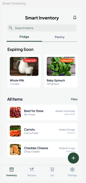
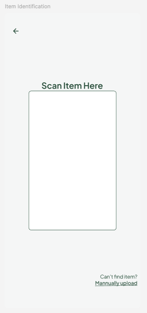
The inventory highlights food marked as expiring soon. The proposed scanning flow is intended to make adding items easier; ongoing inventory accuracy remains an untested assumption.
02
Turn ingredients into meal ideas
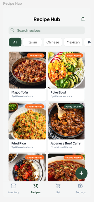
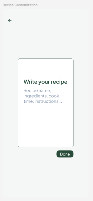
The recipe hub shows ingredient availability at a glance and lets people add a personal recipe when the right option is not already there.
03
Guide cooking and the next shop
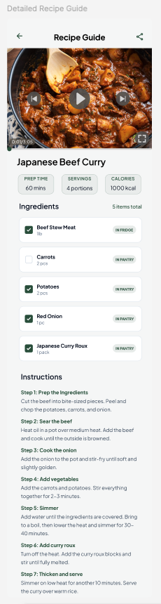
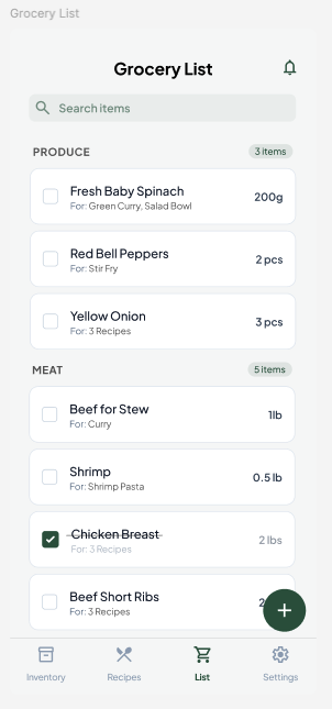
Step-by-step instructions, optional video guidance, and a categorized grocery list carry the plan into action.
Testing & Insights
Feedback led to three prototype changes.
I conducted usability testing with 10 potential users. Their feedback highlighted three improvements: a lighter scanning screen, a way to add personal recipes, and navigation labels consistent with page titles.
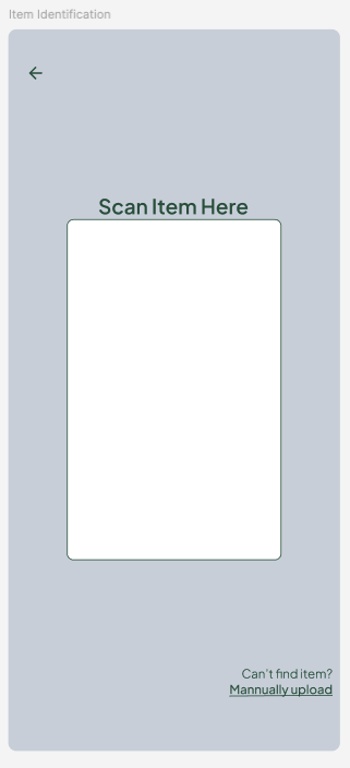
The scanner background moved from muted blue-gray to white for clarity.
Testing revealed the need for a create-your-own-recipe pathway.
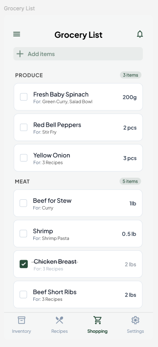
The navigation label now matches the Grocery List page title.
Project Scope
The project demonstrates a researched product concept.
Reflection
Inventory effort is the next product question.
Feedback informed changes to recipe creation, navigation, and visual clarity. It did not establish whether the product saves effort in a real kitchen. Before extending the feature set, I would test ingredient updates and meal selection together, including partially used items and missing ingredients.